Zinvest
Brokerage app for investors in U.S. and Mainland China

Overview
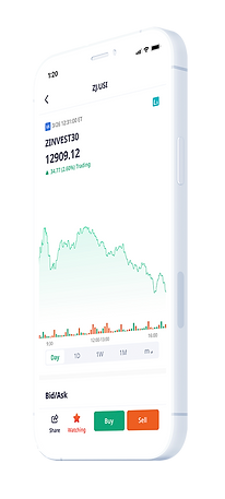
Zinvest Global is a digital brokerage firm transforming the online investing experience in the U.S. and Asia. It delivers a powerful investment experience by allowing users to invest in stocks, ETFs, and ADRs – all commission-free.
Problem
Tools Used
Figma, Adobe Illustrator and Photoshop
What did I do?
UX/UI Design - Research, Interaction Design, Visual Design, Prototype, Testing
Zinvest is breaking into the international market to grow its user base. The current app needed an RIA account feature, a more simple and convenient interface, and a stronger brand identity.
Solution
Designed a brokerage app for beginner and advanced traders to learn and experience.
“When making financial decisions, Chinese Americans were more likely to say that they place their trust in family and friends."
“The #1 reason people get into trouble with their finances is because they really don’t have the skills to manage their money.”
"Chinese Americans are more likely to keep up with what is going on in financial markets... gather information and news to support their financial decision making."
"Market experts have noted a large portion of new investors appear to be from younger demographics."
Viewing our Competitors
I looked into its competitors' strengths and weaknesses to understand how Zinvest could stand out among its competitors. I looked into brokerage and Robo-advisor mobile apps that's currently in the market.
Direct Competitors


Indirect Competitors


Design Patterns
👁🗨
Custom Watchlist
Allowing users to organize their stocks by creating customizable watchlists.
⚪️
White Space
Using white space to declutter all the info. on the screen for easy readability
🖼
Illustrations
Using illustrations to aid content in a visual way
🟢
Color Differentiator
Using green or red to represent an increase or decrease in stocks.
Tapping into the Minds of Investors
I conducted in-person and remote 1-on-1 user interviews with 7 participants who uses a stock trading platform in the past 12 months. I interviewed people who uses Zinvest, as well as other trading platforms. Most participants trades from time to time, and feel like they need to learn about investing smarter.
💁🏻
"I'm capable of doing research and finding out what I want to invest in because I feel a certain way about a company and its practices that I rather do it myself."
💁🏻♂️
"A lot of people post on the investing subreddit and read their thoughts. I try to do my own research and come up with a decision whether or not I want to put money into them or not, and learn"
💁🏼
"When you see your money grow or when you see the percentages, it just feels good, so you just naturally want to buy more."
💁🏻♀️
"If I had a difficulty signing up an account or something, I wouldn’t want to refer that to my friends.
Empathy Map
I gathered all my notes and recordings by transcribing them into an empathy map to discover patterns and gain insights from my participants.

Patterns Discovered
📰
Articles
7 out of 7 read articles about how the market is doing.
People need to stay updated with the news.
🏢
Details of Companies
5 out of 7 read the company's analysis to learn more about them.
People need to be well-informed about the company they invest in.
📱
Overview Screen
5 out of 7 like to see an overview of their account on one page.
People need to know how all their investments are doing.
💬
Comments
5 out of 7 look at comments from other investors to see what their thoughts are
People need to know how others feel about the market.
Designing for our Potential User
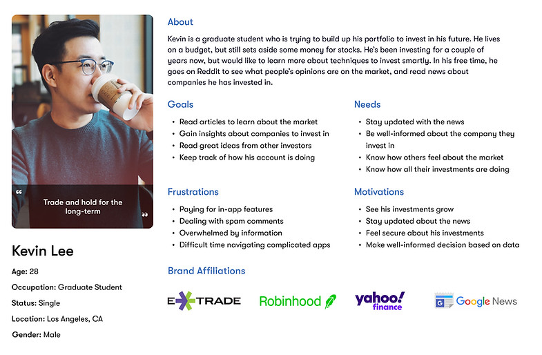
Kevin was created to represent our target market: The Millennial Trader. He's been trading for a couple of years and has invested a lot in his portfolio. His knowledge in investing is limited, but he is open to learn more about investing and how to trade smarter.
01. Research
Learning about the Industries
I researched more about the finance industry familiarize myself with the trends, demographics, and pain points. In the midst of COVID-19, we've been seeing more of the younger generations trading on these platforms, but many do not have the skills to manage their money and trade.
02. Define
POV and HMW Questions
I framed the problem from Kevin’s point of view to define the problems I was going to solve. I then translated these POV statements into HMW questions so that I could begin brainstorming solutions.
Problem #1
How might we help Kevin access relevant articles to learn more about the market?
Problem #2
How might we make it helpful for Kevin to learn more about a company?
Problem #3
How might we make it easy for Kevin to learn what others think about the market?
Problem #4
How might we make it convenient for Kevin to see how his investments are doing?
Brainstorming the Solutions
My co-worker, Brian, and I were able to come up with several solutions pretty quickly, and brainstormed interesting features that we could potentially integrate in the app - Community feature, Resource Center, Promotions, and Personalized E-mails. This really helped us come up with many ideas.



Feature Roadmap
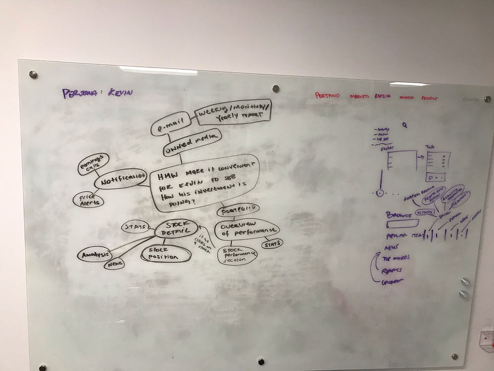
From our brainstorming session, we listed and prioritized features that would help solve Kevin's problems and help organize what the app will need to have.
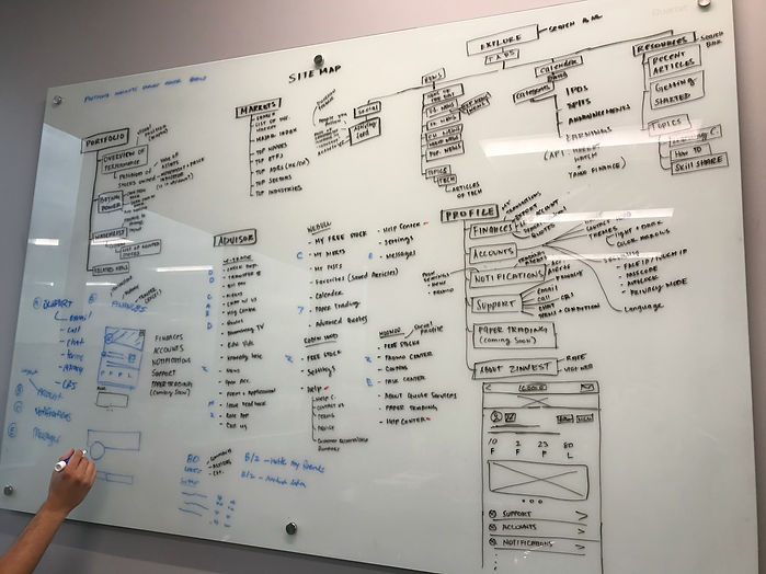
Informational Architecture - Sitemap
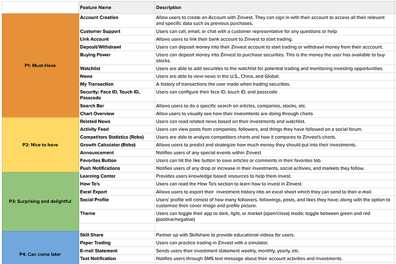
Brian and I worked on the sitemap to outline the entire app. We reference back to our mind map, persona, and feature roadmap to help categorized each features in their respective category that is intuitive for Kevin.
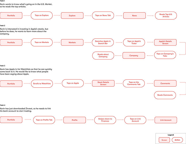
Task Flow
The flow was created to help me visualize an overall picture of each task and gives me an opportunity to create a more seamless experience for Kevin.
User Flow
I created a user flow to observe Kevin’s thought process and all the potential paths she could take when completing his tasks, so I could design the screens to accommodate the different decisions.

Mid Fidelity Wireframes
After planning out the screens, I created the mid-fi wireframes to help me visualize the layout, structure, and hierarchy of these screens that would be intuitive for Kevin. This is when we had the RIA (Retire Investment Account) account included.

03. Ideate
04. Testing
Usability Test
I conducted an unmoderated usability test with 9 avid traders, giving them 11 tasks to complete. Most participants had difficulty time finding things since the prototype was in mid-fidelity, and some didn't understand why a financial app needed a community section. All feedback were recorded and transcribed.
👩🏻
“I just don’t know if keeping track of people’s post within my trading app is important, but any ways, that aside.”
🧔🏻
“I’m assuming that the star will make it into a watchlist, i’m not entirely sure”
🧑🏻
“The company bio was a little confusing because I had to scroll to comment section to click it”
👩🏽
“I’m under the Apple ticker, so I think that I should find something that tells me I can trade”
05. Iterate
Affinity Map
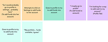
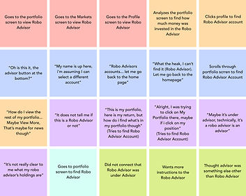
I collected my usability test findings into the affinity map to observe and gain insight in the common patterns. The patterns allowed me to understand peoples' pain points and discover any changes that had to be done on the wireframes.
Patterns Discovered
Watchlist icon not recognizable

Goes to profile to try to fund account
Difficulty finding Robo Advisor feature
Insight #1
People were unsure if the star icon was the add to watchlist icon
Change icon and label the watchlist icon for clarity
Insight #2
People went to the profile tab to funds account when it wasn't there
Include a fund account feature in the profile tab
Insight #3
People had a hard time finding the robo advisor feature tab.
Rename 'Advisor' to 'Robo-Advisor' in the navigation bar
Design
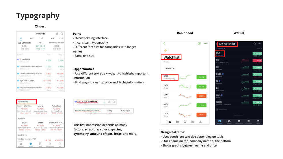
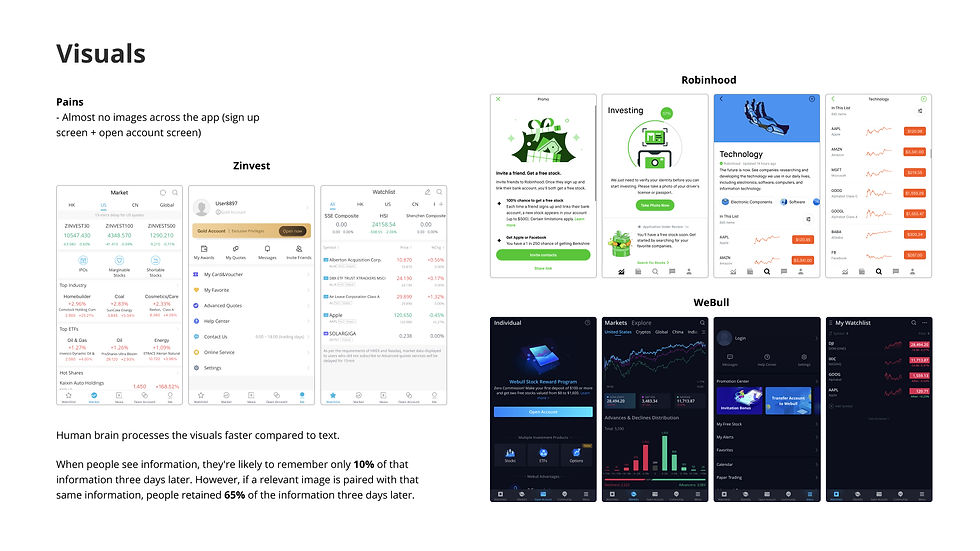
After discussing the branding to my co-workers and the CEO, we made the decision to rebrand Zinvest. With Zinvests' brand attributes - Fun, Growth, Helpful, Professional, and Simple, in mind, I took several steps to create the brand to what it is today.
UI Comparative Analysis


UI Kit
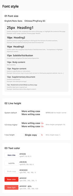
Referring to my mood board, I gathered the visual elements to help make decisions on Zinvests' typography, color, and app design. The UI kit will be updated based on the changes made in Zinvests' app.


Design Iterations
After creating the high-fidelity wireframes, I sent over the screens to the developers in Beijing to discuss about any technical constraints and changes. There were some minor concerns about certain screens.
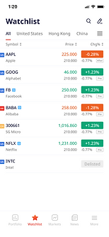
01 Watchlist Screen
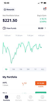
The watchlist was originally going to be combined with the portfolio tab, but after receiving feedback, it was recommended to create its own tab for users to easily view their watchlist, especially when they have a lot of stocks saved.

Before

After
Before

After
02 Portfolio Screen
Investors like to trade quick. The updated portfolio screen allows them to quickly trade and access other features conveniently.
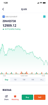
03 Stock Details
The stock details page was updated; allowing users to conveniently buy/sell a share without tapping on the trade button, which would normally expand into buy/sell buttons. Small details were added in the updated version - type of market, time, stock info. icons.
.jpg)
Before
After
06. Solution
Revisiting Kevins's Problems
Problem #1
How might we help Kevin access relevant articles to learn more about the market?
Kevin can access articles through the news tab where he could read articles on the companies he is currently watching. He can also view the calendar for any daily updates.
Problem #3
How might we make it easy for Kevin to learn what others think about the market?
Unfortunately, after speaking with the developers and CEO, we are unable to have this feature because of the deadline and lack of technical resources.


.jpg)
Problem #2
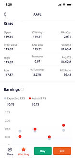
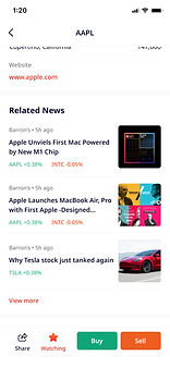
How might we make it helpful for Kevin to learn more about a company?
Kevin can learn more about the company by going into the company that he's interested in and read the companys' financial details and related news.
Problem #4
How might we make it convenient for Kevin to see how his investments are doing?
Kevin can view all of his investments in the portfolio tab. He also has the option to expand the graph to see how his investments are doing overtime.
Hi-Fidelity Wireframes

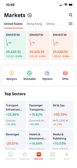


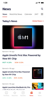
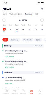.jpg)

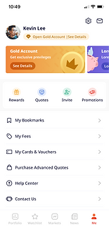
I created a dark mode version for users in Mainland China because when the market is open in the U.S., it is night time in China. Creating a dark version would decrease eye strain when the app is being used at night.
Conclusion
Designing this app has been one big journey. Coming into Zinvest, I had no knowledge of stock trading, so learning about the industry and designing the app has taught me how to save and invest for my future.
This was my first time collaborating with developers in Beijing. It was very interesting to work with people with different ideas and cultures.
Being the only designer on the team has opened my eyes to how important it is to have a team, but I'm grateful I had my co-workers to help me in the process and answer all my questions. I’m glad that I had the opportunity to create a product that helps people learn and invest.
Next Steps
Since the app has been completed and sent to the team in Beijing, the next steps have been updating the screens based on their feedback and regulations. We have plans on testing out the beta version of the app and releasing it for users in India and SEA.
Explore Other Work


